An updated brand for a chain of pet stores
The chain of professional pet stores "Beethoven", which has been operating on the market for over 20 years, turned to the LINII agency to develop a brand platform, identity concept and verbal communication.
The company affectionately calls its target audience "pet parents", acting as a mentor who always knows what to advise someone and shares experience. This is where the archetype of the Sage manifests itself, but the ease and familiarity in communication with consumers reveals the archetype of the Simple Guy.
Thus, the first archetype supports the image of a professional and expert, and the second ensures empathy and care in communications. The essence of the consumer brand was formulated by LINII strategists as follows: "Beethoven and Co - double expertise in the language of love for pets." In the new identity, the pet became the center of attention, and the brand began to demonstrate that it understands the language of your pets.
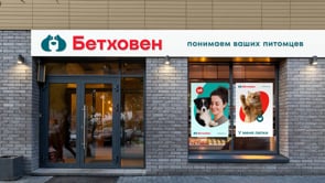
The old sign, used since 1995, was long outdated and did not meet modern requirements. Its shape - more square than horizontal - did not work well on the signboard, not using the capabilities of the format. On the signboard, the logo looked insufficiently noticeable, and in the online format - too detailed and difficult to read. The lack of character and uniqueness made it less memorable, which required an update to improve the effectiveness and modernity of the visual image. LINII suggested making the logo horizontal so that it would look large and noticeable on the signboard. An important element was the creation of a separate sign that could be used in the application icon and on the bracket panel.

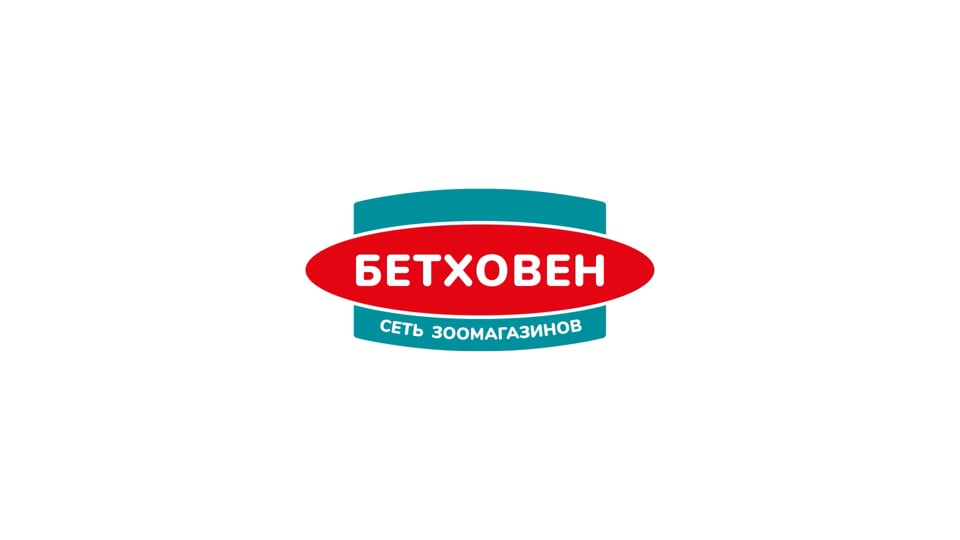
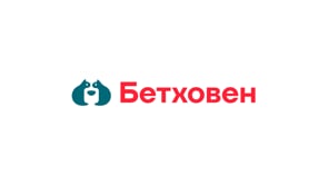
The oval shape was used as a metaphor: it symbolizes the center of attention - pets. The brand illuminates their needs like a spotlight and shows its readiness to fully understand them and satisfy the needs of both pet owners and the animals themselves.

In the new logo, the design team retained the consistent colors - emerald and red — for brand recognition.


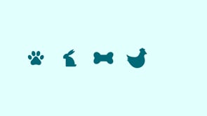
In addition, the team created a series of icons and defined the principles of navigation inside the store for the convenience of visitors.
Yulia Plotnik, creative director of LINII: "The new logo is a bright, charismatic symbol that clearly states that the brand belongs to the world of pet stores and helps to stand out from the competition. Thanks to the expressive and modern design, "Beethoven" acquires uniqueness and memorability, strengthens the emotional connection with the target audience."

This work is not only an update of the visual identity, but also of the positioning: it will emphasize the company's expertise, its innovative spirit and sincere care for customers.
Vyacheslav Uvarov, Deputy General Director for Commerce and Marketing at Beethoven: "We focus on service and expertise. Our customers are mostly women, and a good store has been created for them in the consultation areas, fitting rooms, and a large veterinary pharmacy. We opened an experimental store of 70 m² at the address: ul. Alabyana, 7."

Other projects

VkusVill
Development of an ecosystem for one of the most prominent retailers in Russia

Magnit Market
Branding for a marketplace of a large retailer

M.Video in Botanika mall
New retail concept for home appliance stores

Periodiсa
A cozy hotel of memories: a retail concept for a photo printing service.

Makro
Rebranding of a large Uzbek food retailer

Chitai-gorod
Life in books: redesign and retail concept for a federal chain of bookstores

M.Video
Rebranding of the leading Russian retailer of electronics and household goods