Life in books: redesign and retail concept for a federal chain of bookstores
After the merger of two large bookselling chains — Novyi Knizhnyi and Bukvoed — the Russian federal chain of bookstores Chitai-gorod (Reading city) emerged in 2008. In 2009, the company opened stores under its own brand. As of December 2021, in Russia the network consisted of more than 550 stores in 187 cities.
Chitai-gorod turned to LINII to redesign the brand and develop a retail concept for its stores.


The creative idea for the brand sounds like «Life in books». This ambiguous phrase traces a literal look through the books on the shelves, a transfer into the world of book plots and characters, and a connection with the graphic concept of style.
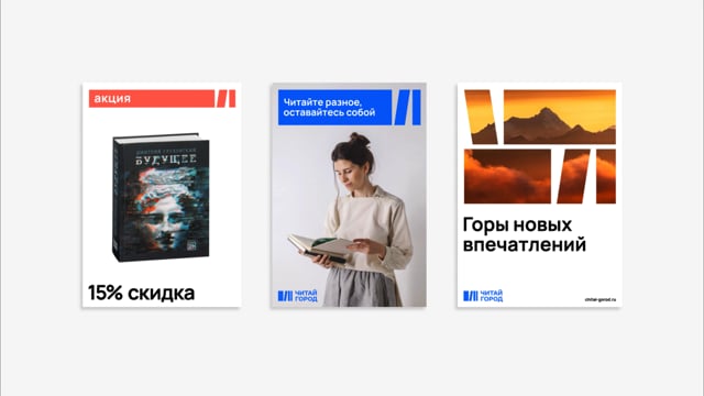
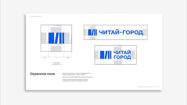
The identity of Chitai-gorod is built on the plasticity of the sign and the simplified image of the book. The logo represents a set of books through which something more can be seen — and that something is always changing. This effect is developed by a plastic transforming element, thanks to which books become windows into other spaces and worlds, and the brand acts as a guide to the universe of literature, its plots and meanings.


The image of the book, simplified to a rectangle, appears in the further development of the identity, becoming a recognizable part of illustrations, icons, and the basis of brand elements.


Chitai-gorod offers not only books, but also stationery, toys, and souvenirs. It was important for the brand to highlight certain seasons and holidays that influence the range. This style is responsible for additional variable graphics, built into the composition of the sign and referring to the corresponding topic.


The first pilot Chitai-gorod store can already be visited in the Metropolis shopping center on Voykovskaya. Its area is about 500 square meters.
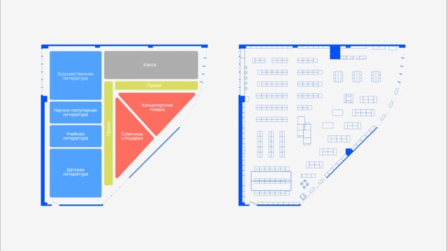
LINII developed a new retail concept for the store based on research into the customer experience in order to improve it and increase customer comfort in the store. The space was optimized taking into account the customer’s wishes - to place new zones and activities in a relatively small area. As a result, they created a modern, functional bookstore space that corresponds to the rhythm of the city.


The agency team developed a buyer path, new zoning and planning solution. The retail space now features a comics department and a themed children's literature department with a Montessori area, several types of reading areas and a coffee corner.






LINII simplified and reduced the number of corporate colors in the store space. By adding wood texture to the shop equipment and focal soft lighting, the store became more cozy and friendly.


The redesign also included: copywriting, navigation in the store space and the development of a detailed guideline.

