Makro

Neighbourhood shopping: rebranded Macro Uzbek retailer
MAKRO is one of the largest retail chains, present on the Uzbek market for over 10 years. The retailer offers chain standards of quality and benefits along with an atmosphere of warmth and cordiality.
MAKRO management contacted the LINII agency to develop positioning, identity and retail concept.
LINII strategists figuratively compared the atmosphere in MAKRO stores with life in a mahalla, a dense low-rise development. Here, the urban environment exists at the junction with the provincial, life is in full swing on the streets. Just like in MAKRO stores, employees work for the benefit of customers, keep order, display fresh goods and happily communicate with customers.


The MAKRO brand is “a neighbor who has become a true friend.” The Simple Guy archetype best reflects this role. He is “like everyone else”: honest, easy to communicate with, empathetic, does not know how to pretend, accept others and wants to be accepted himself.
The developed visual style is aimed at supporting the platform and the character of the brand. It is positive, easily integrated into the environment and people's lives.
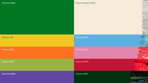
The corporate palette consists of the main fresh green and sand colors, and additional colors inspired by fresh products. The contrasting and unique combination of main colors and a variety of bright additional colors distinguishes the brand from other grocery retailers in Uzbekistan.
The basis of the visual code is the hands. Hands are a very important symbol in Uzbekistan, without which no greeting, hug, fruit selection on the counter and sharing fresh bread with a friend or neighbor can do.
Photographic images of products combined with illustrations add dynamism and humanity to the whole style.





The image of the mahalla with its architectural and cultural features formed the basis of the design concept of MAKRO stores. A harmonious combination of nature and the urban environment, the aesthetics of courtyards adjacent to home gardens where they grow food for their own table - this is an unfamiliar format of urban farming for the Western world.


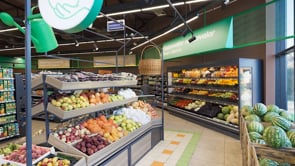
The interior solution uses a visual code familiar to customers from childhood: sand, stone, local wood. Thus, the overall design of the store is based on a warm color scheme and lighting, natural textures. The store looks cozy and welcoming. The signature green color creates accents in the space and is used delicately in navigation, bright colors additional colors appear in communications to attract attention.
Local authenticity in the space was achieved through the use of awning structures in the navigation, imitation of wooden signs, as well as panel brackets with illustrations of product categories. The mesh structure on which they are placed imitates a fence, and for accent lighting, lamps in the form of street lamps are used.



The customer route is built by placing focal product categories for the convenience store format along its perimeter: fresh vegetables and fruits, chilled meat, dairy products, bread and pastries. The counter with a round tandoor for baking bread is also a point of attraction.


Gulya Omorova, Head of Trade Marketing Department Makro: I would like to share the results of 9 months of cooperation with LINII. The rebranding of the chain was a significant test, improving the customer experience and bringing Makro closer to customers. This is the merit of the entire team. The company's strength is in its people and their trust.



Based on the results of research and interviews with retail representatives, it became clear that consumers value communication with staff and the ability to choose goods, as in the market. A counter area was provided for the category of meat products, cheese and tandoor. The store also has a new cafe area with coffee and ready-made food, it is combined with the baking area, seating is provided inside and outside the sales area.

The flooring with colorful tiles, referring to carpet patterns, highlights the focal categories and the checkout area, supporting the general idea of good neighborliness.
Напольное покрытие с колоритной плиткой, отсылающей к ковровым орнаментам, выделяет фокусные категории и кассовую зону, поддерживает общую идею добрососедства.


On May, 2024, the Makro team opened the first convenience store in the new concept at Katta Oktepa MFY, Nurafshan street, house 23a).
