ZAVERNITE! (Wrap it up!)

Branding for a fast food restaurants chain specializing in shawarma
Fast food "Wrap it up!" is the brainchild of Yeghia Asatryan, a successful commercial real estate and agricultural development entrepreneur. Inspired by street food in Singapore, he opened his first youth and family-friendly restaurant.
The project was planned as a chain of fast food restaurants in next-to-door format. Cute and clean stalls, four or five seats, an open kitchen and simple but tasty menu items were supposed to convey coziness and naturalness. Ideally, I wanted to create something similar to the old McDonald's with its high quality standards, excellent marketing and franchise system.


It was necessary to come up with a readable, light, memorable and emotional name that would not exude the atmosphere of typical subway doner stations. So we proposed the original and protectable phrase Zavernite! (Wrap it up!).
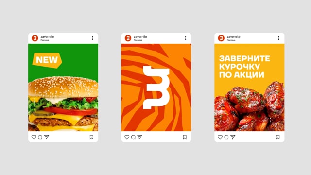
In the font logo, the designers joked a little with the letter Z: if it is rotated by 90°, it turns into Ш letter (a direct hint at shawarma in Russian).


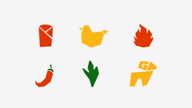
The signature pattern imitates the main dish, as well as the process of its preparation and mixing of ingredients.
The color palette screams amazing flavors and fresh ingredients. Appetizing shades clearly make it clear: this is not a vegan salad, but a full and satisfying meal.


