Talatu

Brand development for a paint and varnish plant
In 2022, a new player appeared on the Russian market of paints and varnishes — the innovative brand Talatu with a Nordic character and Scandinavian roots.


At the strategy development stage, a brand audit was carried out, interviews with business owners and the team were conducted. Global and Russian market of paints and varnishes was analyzed.
“In a very short time, we developed several positioning hypotheses, among which the idea of Think Global Act Local was chosen. It combines Scandinavian expertise, knowledge of the local market, experience in working with large government and commercial projects, the highest quality standards and team flexibility”

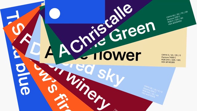
The brand's signature color scheme consists of active blue, black and white. Intense blue emphasizes the purposefulness and dynamism of the corporate brand.
If in B2B communications calm colors and real life photographic style are used, then in B2C bright colors and photographs with human emotions expressing openness and kindness are allowed.

The result of the well-coordinated work of the agency team and the Talatu team was a brand book with a description of the positioning, brand mission, as well as the rules for using the logo and a layout designer.


The next big step was the development of packaging design and names for four product lines: enamels, paints for facades and wood, and interior paints. The names are in the style of the Finnish language: RYTMI, SKETSI, KAUSI and KUORI.


Each image on the label is clear and unambiguous: the shape of the drop indicates the ductility of the enamel in the jar; rounded patterns reminiscent of a cut of wood indicate paint for wooden surfaces; paint for facades is poured into cans with geometric outlines similar to the architectural elements of buildings; packaging with interior paint shows marks from a roller and brush.


As a result of this stage, a mini-guidebook on packaging was developed, in which the design system was recorded, methods of working with product lines were described, and recommendations on fonts and color palettes were given.
And this is just the beginning, because the Talatu team has many more ideas for expanding product lines.

“When working on the project, the LINII design team relied on the Scandinavian style and more than 70 years of Talatu’s history, filled with Russian and global experience, in order to reflect the confident character of the brand. Smart minimalism and indirect associations in graphics, restraint of fonts and color palette of the developed identity create a confident feeling of reliability for Talatu’s clients and partners”


