Rosgosstrakh
Rebranding of a company that has become a symbol of insurance in Russia
In 2021, the oldest insurance holding in Russia, Rosgosstrakh, applied to LINII for a rebranding for its 100th anniversary. The update affected the logo, corporate identity and the entire brand portfolio of affiliated companies.
The challenge was to harmonize the combination of the long Rosgosstrakh history and modern trends.

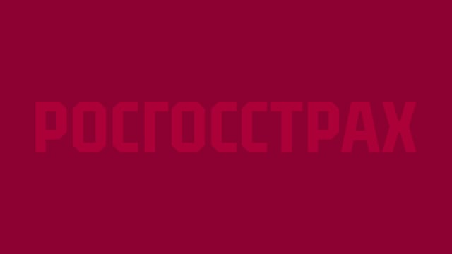
The new logo retained the geometric, stable character of the previous solution, but at the same time became unique. The font is built on the basis of an octahedron. This geometry became the basis for the corporate identity.
The eagle has ceased to be a part of the logo, but we have not completely abandoned it. The updated emblem has reduced details, the graphics became more concise. Thus they reflect current design trends.

As part of the restyling, the main attention is focused on the font part of the Rosgosstrakh logo - the eagle has turned into a decorative element without losing its visual significance.


The color scheme of the brand also retained historical continuity, but moderately refreshed with additional shades. An important part of the corporate identity was the pattern created on the basis of the company's historical heritage and executed in a modern style.


