Rosgosstrakh. Anniversary identity
Limited edition identity for the oldest insurance company in Russia
The logo for the 100th anniversary includes simple geometric shapes — a circle and a square. They are scalable depending on different carriers of the corporate identity, and are also filled with text and graphic content.
As part of a global rebranding project, we have developed a special anniversary style based on the principles and techniques of Suprematism. The 100-years logo includes simple geometric shapes - a circle and a square. They are scalable depending on different carriers of the corporate identity, and are also filled with text and graphic content.


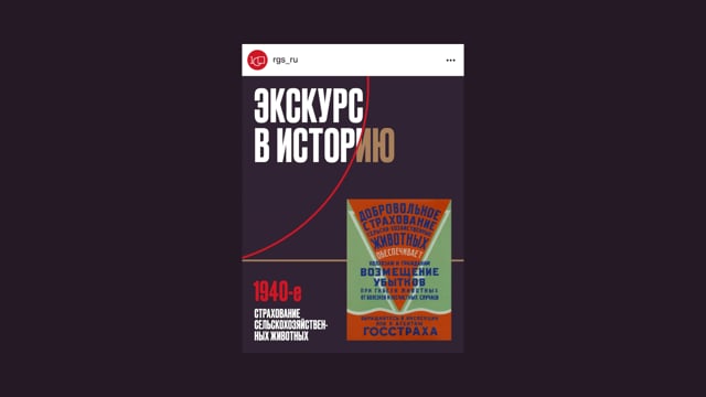
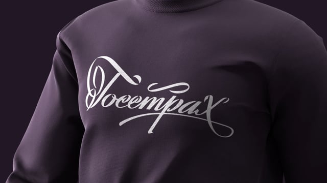
For souvenir design we used old logos, which were preserved in the company’s museum exhibitions. This decision visually reflected the heritage and history of the Russian insurance giant.


Valery Sadovsky, LINII designer, shared his feelings about the cooperation: “Unlike European brands with their centuries-old visual heritage, there are almost no such brands in Russia. There are no Swiss banks, no British manufactories. It was doubly pleasant and honorable to work for a domestic company that is proud of its history".


