Naming and identity for Mediterranean restaurant
Moretto is our new project. It is an affordable restaurant with Mediterranean cuisine specialized on seafood. It can be placed in completely different locations: organically integrated into food courts in shopping centers, located on the ground floors in residential areas or in a separate room.
The LINII team had to develop the name and identity of the establishment, taking into account the concept and focus of the cuisine.
When developing the Moretto name, the agency’s specialists relied on the brand’s DNA: associations with the Mediterranean, the feeling of summer and carefree relaxation.
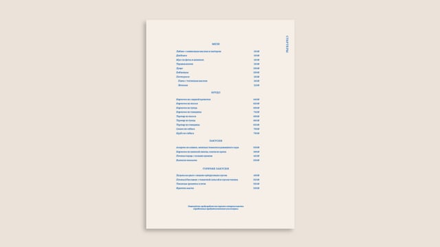
The identity supports and develops the theme of sea travel. The light and airy Moretto font logo, combined with signature arched elements, illustrations and bright, summery colors, creates a cozy atmosphere of coastal cities.


As part of the project, a guidebook has been developed. It contains rules for using the identity, photographic style, corporate illustrations, and design for major online and offline media.
When creating the project case, we were faced with the task of conveying the summer vibe of the brand, creating a coherent, aesthetic image, given the impossibility of photography. Thus we used the neural networks, detailed elaboration of individual elements and details in each frame to achieve the desired effect.


