
Rebranding of a top-3 banks in Tajikistan
Bank Eskhata celebrates its 30th anniversary!
Today it is a private independent financial institution with foreign capital, providing all basic banking products to individuals and legal entities. One of the three largest banks in Tajikistan.
After 30 years of work in the market, and especially during active development in the last 10 years, Bank Eskhata faced a need to rebrand, revise its positioning, update its visual image and create a unified design system with clear rules for working with the brand, as well as developing a communication strategy that is closer and more understandable to people.


Renat Gainiev, head of the marketing department at Bank Eskhata, revealed the prerequisites for the rebranding and explained the choice of the agency: “The Central Asian market is not replete with expertise in branding, so we turned to the LINII team, which has relevant experience in solving similar problems. Bank Eskhata is entering a new stage of its development along with the entire retail banking market in Tajikistan. Through this project, we are systematizing our communication, refreshing our brand and making it relevant.”

The very name Eskhata (translated from Tajik as remember) reflects the entire complex of brand values: the concept of family, close circle of people, transparency, attention to everyone and constant inclusion.
The brand’s goals were to enter every home in Tajikistan and become an integral and full-fledged part of every family and every business in the country. Superiority and leadership in the field of financial services have become the main tenets of the brand's mission.
The essence of the brand is short and simple: bank for the close ones. The character of the brand clearly demonstrates knowledge and care for its customers, which is reflected in the archetypes of the Sage and the Parent. Being an expert in financial matters, the bank, like a reliable friend, tells everything about financial products in a simple and accessible way.
This is where the role of the brand comes from: а financial advisor who accompanies you every day, helps, advises, guides and cares about your comfort and well-being as if it were his own.

The LINII design team reflected the company's high professionalism and empathic approach to people in the updated design system.
The brand name is a monogram with a unique combination of the letters "E" and "B".


Creative director of LINII, Yulia Plotnik, spoke about the key element of the new identity: "The blue line is one of the main graphic elements of the brand, which symbolizes the constant support and daily presence of Bank Eskhata in people’s lives".
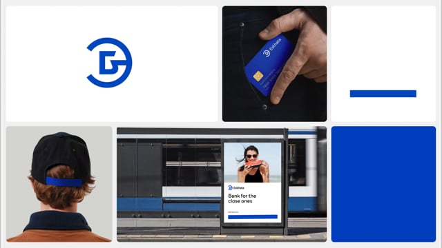

The updated identity retains the recognizable blue color, but modernizes its shade. Additional colors also appeared in the palette: sky blue and «friendly» sandy.
The image photo style developed by LINII is based on large portraits of modern residents of Tajikistan, men, women, children and animals, which look natural and sincere. The characters express a wide range of emotions — from a calm, easy smile to an infectious laugh.

Bank Eskhata now has clear rules for working with identity — a detailed brand book — that saves time. The style of 3D illustrations is described, pictograms, image and product photo styles, as well as advertising banners and posters are created.
In the communication strategy, the LINII team proposed focusing on mass educational communications demonstrating the benefits of banking products in the lives of ordinary people, and integrating banking products into the daily lives and needs of the people of Tajikistan.
As part of the project, the LINII agency developed positioning, a design system with clear rules for different types of media, as well as a communication strategy.


Dmitry Burenko, development director and business partner of LINII, commented on the joint work on the project: "We are encouraged that the Bank Eskhata team entrusted us with the implementation of a rebranding project - at the same time complex, but at the same time extremely interesting. This is a landmark project for us. It was interesting for us to immerse ourselves in centuries-old cultures".

Video – TAG advertising agency