X5 Group
Rebranding and development of an ecosystem for a leading Russian retail company
The history of X5 Group dates back to 2006, when Perekrestok and Pyaterochka retail chains merged. The new company, which united more than 600 stores, was named X5 Retail Group (X — Perekrestok, 5 — Pyaterochka).
The company's ecosystem should connect different retail stores, B2B and B2C brands, services, products and initiatives of the group into a single system for different target audiences.
The global task of X5 Group is to develop such an ecosystem of services and applications that will emphasize the brand's leadership in the food category. The company strives for conscious consumption and resources usage, including visual ones.
The main principle of X5 Group is not to litter both in physical and visual spaces. Therefore, LINII team's approach was content-oriented, not decorative.
The identity illuminates natural motifs and shapes through tech graphics. The visual metaphor sounds like digital ecology.
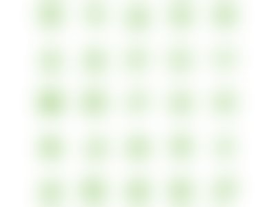
The 3D pattern visually reminds the shape of the leaf in a technological interpretation.
Photo style allows to change the tone of communications: from a bird's view to images to cute pets.
During the project, it was decided to create unique corporate font. Paratype was chosen as developer. As a result, the brand received X5 Sans and X5 Sans UI typefaces with an unlimited license.
Thanks to the storage of pictograms, it was possible to unify their style for the entire X5 Group ecosystem.


They are divided by subject: plots, portraits and objects.


Unlike the usual branding project, there was a huge amount of media outside the commercial part: conferences and public reports, reports for investors, X5 Group social and economic impact assessment visualization, the Basket of Kindness charity program, etc.
As part of the detailed study of the brand architecture, in addition to the corporate brand identity, corporate styles were developed for the sub-brands — X5 Import, X5 Tech, X5 Bank and X5 Club — which offer different products and communicate with different audiences.

All X5 Group sub-brands use their own visual codes, rather than a conventional leaf image or a wave pattern. And there are reasons for this.
X5 Bank and X5 Club new products differ from the main brand and appeal to the B2C audience. They have their own values and compete, in this case, with the banking sector.
The new identity appears at the junction of the product and the consumer: X5 Bank has a pattern of coins, X5 Club has profit symbols (bonuses, addition and multiplication signs).
Galina Sekirinskaya, Head of X5 Group Corporate Brand Department, comments: “The main challenge was to develop an identity that would establish order in all the variety of departments and projects, but at the same time, would give each of them its own voice. We have developed a set of tools that can flexibly adapt to the specifics of businesses, a living identity system. The agency has managed to avoid over-decoration and create a truly 'sustainable' branding, in keeping with current trends in visual ecology."

По итогам II квартала 2025 года выручка розничного бизнеса X5 Group увеличилась на 21,2% и составила 1,16 трлн рублей.