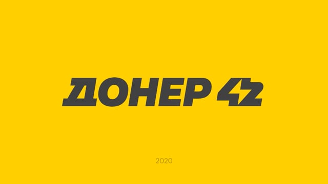
Branding of a technological fast food restaurants chain
In August 2020, the Dodo Brands team decided to create a strong shawarma brand that would compete with McDonald’s, Burger King, KFC, SubWay and other industry players.
Many people associate shawarma with youth and student life. On the one hand, this product is surrounded by trash aesthetics, and on the other hand, it is transformed into modernity. It has determination and energy, internal rebellion and freedom.


In this project, for the first time we had to edit our own design after a year. The project was launched quickly in an MVP format, passed testing and was ready for changes and improvements in a year.


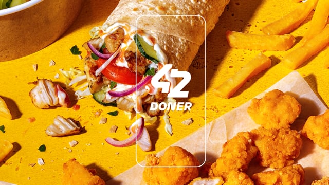
Also, an additional meaning appeared in the sign - the numbers 42 formed a shape reminiscent of pita bread, the main component in shawarma.
We took into account that Doner 42 should look attractive and understandable both in English and Russian.


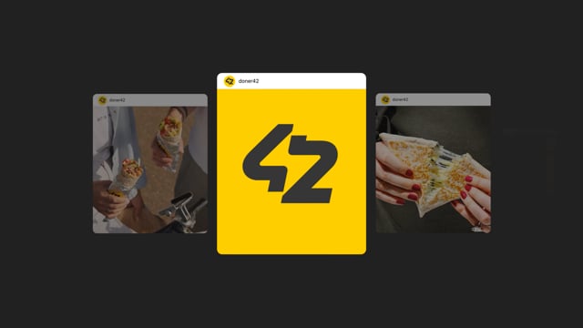
During the redesign of Doner 42, we tested options on employees, partners and foreign representatives who are interested in purchasing franchises. We only calmed down when the vast majority could clearly read the numbers and lightning separately.


To support the concept, interesting furniture, unusual materials, lighting of the neon streets of Night City from the future, as well as bright accents similar to lightning bolts were added to the interior.


The updated design has become significantly more modern and has become lighter and friendlier. Doner 42 still stood out among the «visual noise» in the fast food category, but now it was still perfectly legible and conveyed the concept of the new brand to the maximum.