New Identity for the Fastest Growing Fitness Club Network
DDX Fitness is one of the fastest growing fitness club networks, which has gained popularity in a short period of time thanks to its business model. It is based on accessibility, high quality of construction and equipment, and the creation of a comfortable atmosphere for the training process. The main goal of the company is to attract people who have never done sports before and help them take the first step towards a healthy lifestyle. Unlike many fitness clubs that require an annual prepayment, DDX Fitness offers monthly payment, which significantly reduces the financial entry threshold for new clients. Clients can also use a mobile application to track their workouts and receive free introductory classes with trainers, which helps to quickly adapt to the training process.
The DDX Fitness brand is aimed at ordinary people who want to start doing fitness, but have fears and doubts.
The new brand strategy of DDX Fitness is focused on a “healthy attitude to training”: this includes improving the health of clients, calm training without fanaticism, adequate pricing, and healthy relationships within the community.
The chain is actively growing, opening new clubs both in Moscow and outside the capital, including other cities in Russia. At the moment, more than 90 fitness clubs are open. In the next 5 years, the company wants to become a leader in the fitness market of Russia in terms of business indicators and the number of open clubs, and plans to expand to markets outside the country.

DDX Fitness turned to LINII agency for identity development. It was necessary to update the old design and develop a system for working with visual tools. The new identity had to reflect the new positioning, while maintaining continuity in the color palette.


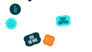
Handwritten elements add humanity and friendliness to the brand: live lines remind us of live communication, attention and support from trainers and the community.

"This system of visual elements precisely conveys the strategy of the DDX Fitness brand as a space where everyone feels support and belonging to the community. This is a place where you are always among your own, where care and personal interaction are as important as the physical result," comments Yulya Plotnik, creative director of LINII.


The old DDX Fitness design was difficult to use due to inconsistency of identity elements, insufficient color contrast, and lack of optical balance in the logo. It also did not correspond to modern design trends.
LINII design team suggested abandoning the outdated logo. The new logo reflects the updated brand strategy and its communication goals.

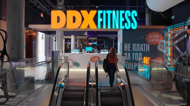
The new DDX Fitness color palette consists of three main colors: turquoise, emerald, and orange. These colors were chosen to create a more modern and dynamic image, as well as to display the color coding of DDX Fitness rates.

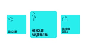
The illustrative style expands the brand's graphic tools, adds openness and recognition to the communication. A design system with a variety of graphic tools for a wide range of media has been developed for the fitness chain: online and offline communication materials, navigation elements inside and outside the club, staff uniforms, entrance area, media for events, merch, presentation templates, printed materials.

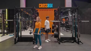
The DDX Fitness photo style emphasizes friendliness and naturalness. The images always feature people doing sports, which helps create a sense of community.

A design system has been developed for the fitness network, featuring a variety of graphic tools for a wide range of media: online and offline communication materials, navigation elements inside and outside the club, staff uniforms, entrance area design, event materials, merchandise, presentation templates, and printed materials.