Rebranding after 28 years: new identity for PIR Expo
PIR Expo is the largest professional event for the HoReCa industry in Russia. In 2025, it will be held for the 28th time. The scale of the event is impressive: last year, it was visited by almost 49 thousand participants, 766 companies and 659 experts in the hospitality industry.

For the first time, the PIR Expo team decided to develop a single, holistic identity so as not to change the style of the exhibition every year. It was also necessary to structure disparate areas (PIR—Restaurant, PIR—Coffee, PIR—Hotel) into a single brand. The LINII agency was chosen to solve these problems.
The "at the common table" concept symbolises the unification of the entire HoReCa industry in Russia. This is a place where each participant feels welcome. Here you can calmly discuss new ideas, find reliable partners and shape a common future together. PIR Expo is not just one event, but a whole complex of different zones, each with its own atmosphere. Together they create a large-scale and vibrant event that unites and inspires all industry participants.
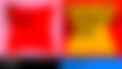
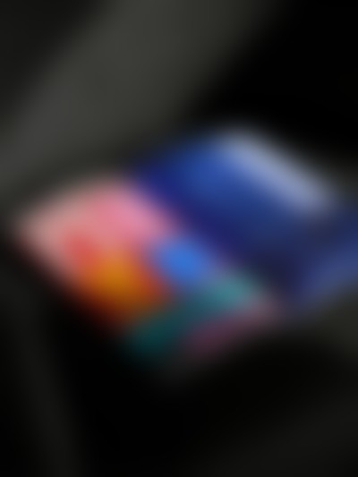
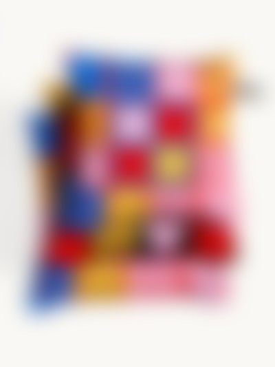
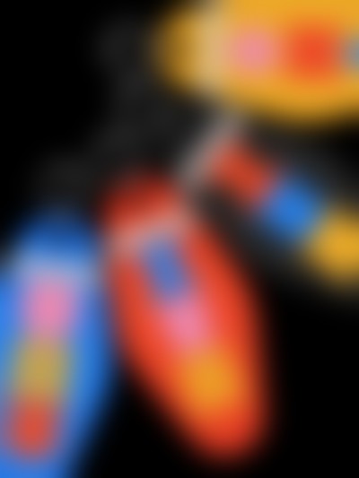
For the PIR Expo areas, LINII developed geometrically simple symbols, such as a cup — PIR—Restaurant, a filter — PIR—Coffee, a pillow and a key — PIR—Hotel. Clear illustrations work as a pattern, which adds flexibility and recognition to the design system.
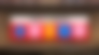
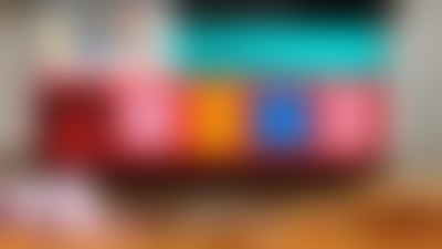
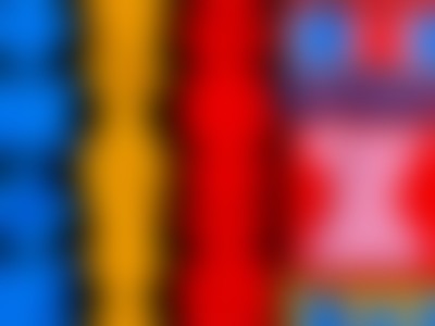
The design team assigned a corporate color to each direction: yellow for PIR—Coffee, orange for PIR—Restaurant, and blue for PIR—Hotel. At the same time, the identity of the PIR Expo exhibition is united by the red color, which we retained to connect with the parent brand.
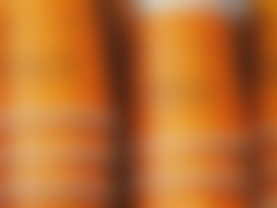
The selected font reflects the character and modernity of PIR Expo. In creating a bright and memorable photo style, the LINII team was inspired by the stylistics of the universe of director Wes Anderson, whose films (for example, The Grand Budapest Hotel or Moonrise Kingdom) are recognisable by their perfectly composed frames, delicate colours, pronounced symmetry and retro atmosphere.

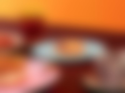

LINII repeated the principle of combining sections used in the exhibition layouts. Each element - be it text, logo or photograph — has its own specific place. This approach is similar to a well-thought-out seating plan: everything is arranged so that it is convenient and understandable.


“This is a rare case when the style went from concept to print without significant changes. The client trusted our expertise and made bold decisions. Thanks to this, together we have created a long-lasting design system that will work at PIR Expo for many years to come."

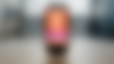
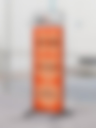
The merch developed by the LINII team allowed us to expand the design system and even create a new direction — PIR—Home. The merch fits into any interior; it can be taken home or easily used in the design of a hotel or restaurant.


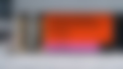
The new identity of PIR Expo is a bright and adaptive design system. It has been transferred to a huge number of media: outdoor advertising, tickets, interior design, photo zones and merch, creating a holistic and memorable image of the main industry event.

“We have been a market leader for 28 years now, and it is very important for us to have a close connection with our audience, what they live for, what they care about and, of course, how they perceive us. That is why we decided to revolutionize our style and brand. And LINII transformed us, having perfectly understood our values, philosophy and needs! Thanks to the LINII team, thanks to you we have renewed ourselves and are growing further!”