M.Video
Rebranding of the leading Russian retailer of electronics and household goods
In 2023, M.Video, one of the top ten global electronics sellers, will turn 30 years old. The anniversary and changes in the market context pushed the retailer to large-scale updates and transformations, to reconsider positioning, logo, corporate identity, communications, as well as to search for a visual solution for the M.Video-Eldorado combined brand. With such a large-scale challenge, M.Video again turned to LINII, as a trusted contractor.

Two years earlier, LINII had already worked with the M.Video-Eldorado group to develop an identity that reflected the company’s active development in the e-com segment and a hybrid format of work, which was based on the mobile platform and the OneRetail omnichannel concept. And in 2016, LINII developed an identity and retail solution for Eldorado.
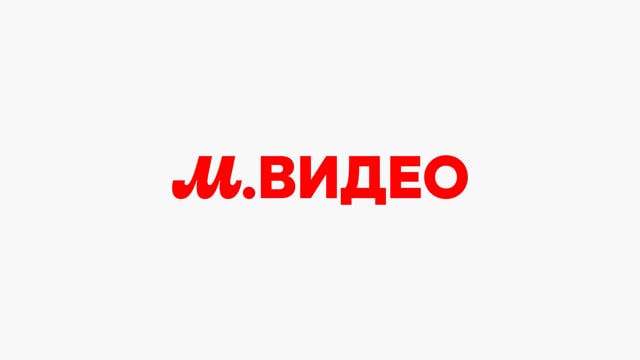

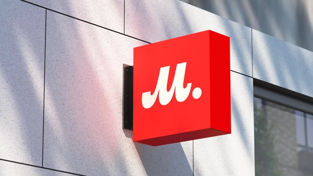
The M-Video brand logo had practically not been updated since 1994 and no longer corresponded to the image of the market leader and required modernization. Functional changes were also necessary. The letter “M” in the logo did not scale well and visually looked out of date.


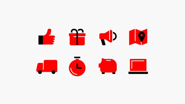
From a business point of view, M.Video has set itself an ambitious goal - to become the “Top of mind” in its category, a store for every Russian family when it comes to household appliances and electronics. This is reflected in the brand strategy. The archetype combines the Ruler and the Caregiver. From the first, the brand inherited control over the situation, leadership, responsibility, organization, structure, order and standardization in everything. This archetype maintains its reputation as a category leader. In the field of customer service, the brand manifests itself in the Caring archetype, nurturing the best in people - altruism, mutual assistance and the desire for a safe environment. In the identity, the Ruler archetype is manifested through the leadership color red, and soft forms in the pattern communicate care.

Yulia Plotnik, creative director of LINII, commented on the project: “Our team proposed a visual concept called Heritage, which will allow the brand not to lose its audience or reduce brand awareness, while at the same time looking more modern and technologically advanced.
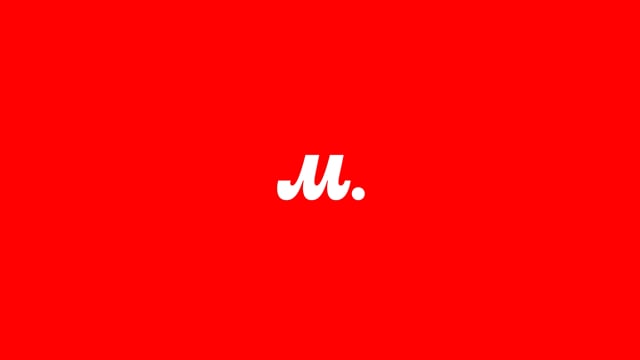
The LINII team modernized the corporate identity, making it extremely clean, readable and noticeable, while maintaining a recognizable character.


We retained the iconic “M”, making it a style-forming element and part of the corporate pattern. Thus, “M” is always natively present in the layout, but at the same time makes it bright and noticeable.”


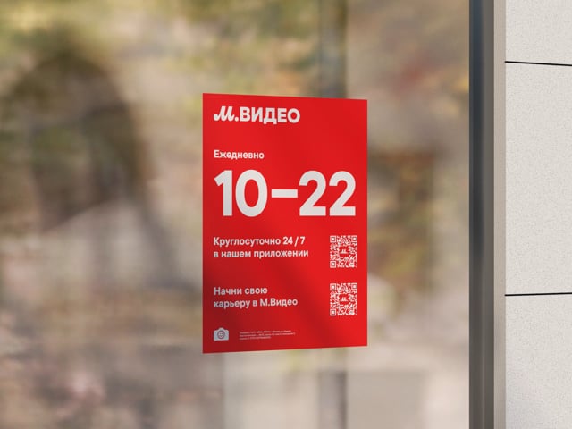


The co-branding solution for Eldorado was developed within the framework of the idea “Behind a strong brand” and became identical to M.Video. Thus, visually there was only one brand left. As part of the project, navigational product offers, OOH layouts, digital communications, offline and online vendor communications, entrance groups, signs were developed, and a unified style of the two M.Video-Eldorado brands was streamlined. Now the brand looks holistically both online and offline.

Mikhail Gubergrits, CEO of LINII, commented on the project: “The logo has remained virtually unchanged since 1994 — this is a huge period for such a high-tech business as retail and electronics. For the Russian market, rebranding of such a scale is a big event and we are glad that such a global retail giant has once again entrusted the project to us.”