Movista
Identity of an innovative service for finding tickets
LINII branding agency developed a strategy, name, logo and corporate identity for the brand. It was necessary to develop a name that, on the one hand, would speak about the service itself (moving from one point to another), on the other hand, would be easy to pronounce and remember. All meanings should be understandable to people of different ages and education. The suggested name Movista was derived from the words Move + Vista. The name communicates the user friendliness of the service.

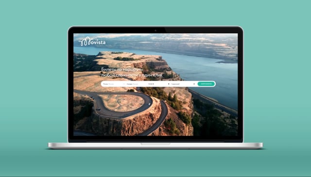
The service helps to plan the trip of any complexity in a best way. Simply enter your A departure point and B arrival point, and then the system will suggest the best travel options by three modes of transport (air, rail or bus) to your destination, comparing these routes in terms of time and budget.


We also chose an interesting color scheme, a combination of turquoise and lilac colors. The corporate identity is based on the flexibility of the route and the convenience of the service using. Corporate graphics, pictograms, photo style — everything says that it is simple and convenient with us.
Movista inspires people to travel more often, helps to organize a trip of absolutely any complexity, to get the most out of it. This product was created so that people can expand the geography of their travels while getting to know our unique country. Now you can easily build not just an optimal route, but rich in impressions — with arrivals and stops in interesting places.
DesignRush, known for its best logo design has chosen our design to be featured among The Best Travel & Tourism Logo".


