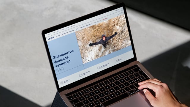
Lassie

Rebranding and retail brand development for a Scandinavian children's clothing brand
Scandinavian technology and decades of experience allow Lassie to create clothes in which children can actively explore the world, following their natural curiosity. At the same time, parents remain calm, because they are sure that their children are completely protected from cold and windy weather.
The agency's strategists proposed the Explorer archetype for the brand, because Lassie looks at the world through the eyes of children, open to everything new.


The tone of communication is in line with the essence of the brand - Lassie speaks to the audience energetically, joyfully, dynamically, clearly and concisely, but always with imagination. It explores the world and is not afraid to ask questions.
In the letter “a” you can see swimming, playing snowballs and sliding down a hill. The laconic forms of the remaining letters refer to Scandinavian minimalism and tranquility.

The diversity of Scandinavian nature and the wide range of the brand prompted a rethinking of traditional Scandinavian flowers. Lassie's signature colors were dark blue Blue Gulf, which symbolizes the crystal clear lakes and fjords of Scandinavia, and light blue Iceberg, which is the embodiment of numerous glaciers and clear skies.
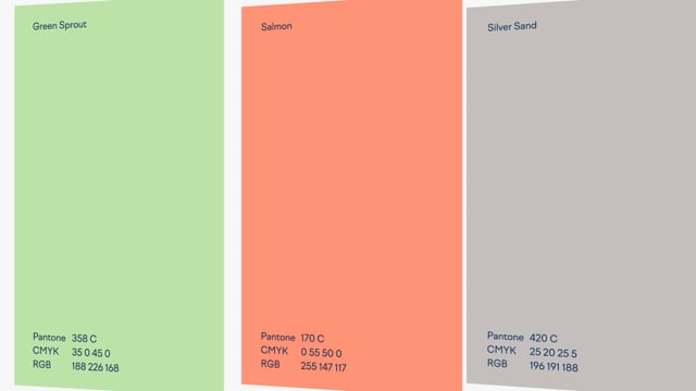
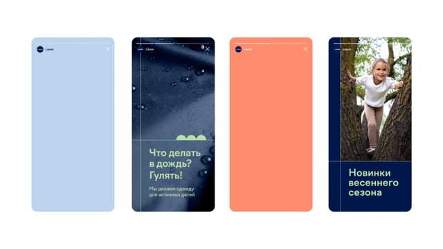
Additional brand colors are light green Green Sprout, salmon Salmon and graphite Silver Sand. They serve to differentiate communication layouts—image situational and product ones.
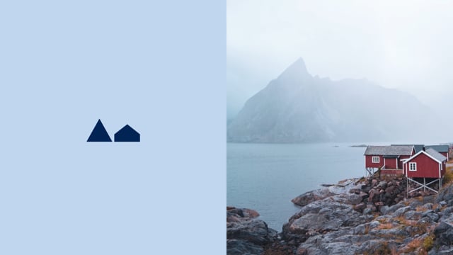
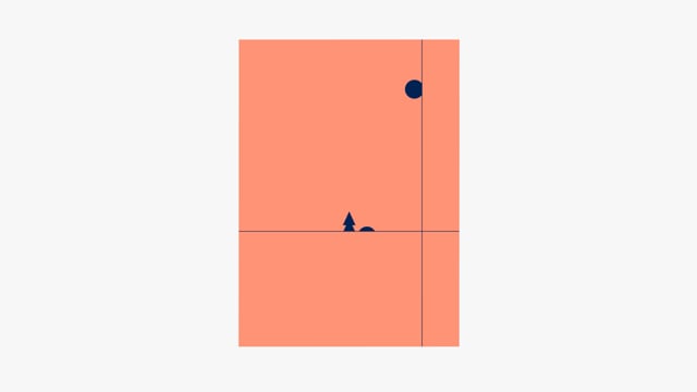
To prevent the children's brand from looking too dry, in addition to the main elements, small geometric illustrations were developed. They can be used to create stories on the theme of the endless Finnish landscapes and nature: mountains, houses, forests, rivers, fields and the soft northern sun.

To highlight the Finnish roots and thoughtful technology of the Lassie brand, the agency's designers created a series of graphic elements in the form of lines that subtly refer to the blue stripes of the Finnish flag.






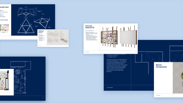
LINII retail specialists conducted an extensive study of international benchmarks of children's and adult activewear, conducted CX research based on interviews with target audience, developed zoning and shopping routes, a retail concept, a preliminary and detailed design project for stores in the Central Children’s Store and the Europolis shopping center.


The breath of the north is conveyed through a combination of cold shades, textures of stone, ice, metal, and frosted glass. To prevent the space from looking overly harsh and unfriendly, we added textiles in “cozy” warm tones, wood in the equipment, warm lighting and other decorative details.


Store zoning is based on an analysis of product categories. LINII retail specialists built the consumer triangle on three attraction zones: Lassie Star, shoes and a brand wall in the form of an ice capsule telling about the brand’s technologies. The play area and exploration of natural materials is an immersive exhibit where children can spin and move elements to explore the world.


