GPB Mobile
Identity of the Gazprombank mobile operator
In December 2020, Gazprombank launched its own mobile operator GPB Mobile, which operates on the basis of Tele2.
LINII were asked to create a corporate identity that should be similar to a bank in terms of character and values, as well as represent the image of a modern, fast, customer-oriented mobile operator.


While working on positioning, we maintained continuity with the parent brand. The bank is creating its own ecosystem to continue communicating with the client outside the financial services. Telecommunications is a good opportunity to expand services, helping a person in a variety of situations.


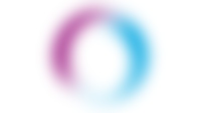
LINII illustrated this energy with a gradient that refers to the connection between people, even when it is not visible. At the same time, the ring is associated with the symbolism of the parent brand, where there are circles.

The visual concept of the new operator includes a logo option, corporate colors, a font, a stylistic element in the form of a circle with gradients, and additional graphics.


The main colors of the brand are blue and purple, which favorably distinguished the brand from the existing operators on the market, made in red, green and yellow. At the same time, cyan and magenta were not chosen by chance.
Gazprombank's brand color is navy blue. To harmonize with it, light blue was taken. As for magenta, shades of purple were also optional with the parent brand.


As part of the identity, design for digital media was created: a website interface, an icon and interface for a mobile application, as well as design for social networks.


