
Improving the shopping experience and discounter design
The chain of discounters "Eshchyo" ("More" )from "Detsky Mir" is a fresh look at the usual retail, combining bright energy and care for customers. This project was aimed at creating a space in which each visitor feels comfortable and easily navigates the assortment.

https://vimeo.com/1124224409
The LINII agency faced an important task - to transform the shopping experience in "Eshchyo" stores, making it as intuitive and logical as possible. It was necessary to analyse the current stores, understand how to best arrange product categories, develop new navigation and design, while preserving recognizable elements of the brand. As a result, we wanted not only to simplify the customer's path, but also to increase sales due to a more thoughtful organisation of space.


В магазине были установлены:
- Настенные навигационные элементы: позволяют легко находить нужные товарные группы.
- Фокусные точки подсвечивают ключевые товарные категории.
- Стеллажные элементы указывают на более мелкие категории.
- Оформление торцов: используется для выделения промо-акций и новинок.
- Оформление входной группы: включает большой баннер, который демонстрирует многообразие товаров, доступных в магазине.
Эти изменения существенно повысили визуальную привлекательность магазина и улучшили функциональность, что, в свою очередь, способствует увеличению продаж.

The LINII team paid special attention to the visual design. They created a more minimalistic and geometric graphic style for the space - they replaced the bright elements of the old brand identity with clear lines and laconic forms. This simplified navigation.
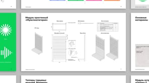
To implement the new concept, various design and navigation elements were developed that helped not only in organising the space, but also in attracting the attention of customers. The following were installed in the store:
- Wall navigation elements: make it easy to find the right product groups.
- Focal points highlight key product categories.
- Shelf elements indicate smaller categories.
- End design: used to highlight promotions and new products.
- Entrance group design: includes a large banner that demonstrates the variety of products available in the store.
These changes significantly increased the visual appeal of the store and improved functionality, which in turn contributes to increased sales.
https://vimeo.com/1124224647