How LINII created a unique identity for a new agrobrand
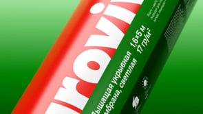
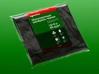
Netkanika is one of the leading manufacturers of nonwoven materials such as spunbond, spunmelt and meltblown for use in finished products for children's, adult and feminine hygiene, medicine and cosmetics, agriculture, construction and other industries. The agency was tasked with developing a logo, packaging design and identity for the Agroviva brand, covering and mulching membranes from the CREATEX© line of materials with high barrier properties, designed to protect plants and soil from adverse external factors.
When creating the concept, the LINII design team delved into the process of “growing” plants and decided to use soil layers as a base. Like soil, our covering materials have layers that have a positive effect on the life cycle of plants. We identified a growth zone, a fertile layer, a root zone and deeper layers.

The logo is integrated into this system, “growing” from the top layer; the letters resemble fruits and plant elements. The rich red color symbolizes a good harvest, fertility and growth, reflecting our hero archetype. Red is always present in the logo or the background underneath it.
This metaphor is clear to the consumer and is related to our product, which serves as an extension of natural layers, creating additional protection for plants from pests and adverse weather conditions.
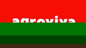


The font with organic letters continues to refer to sprouts and fruits. These are glyphs that add variety to the layout and a feeling of letters sprouting from the ground due to unique serifs and ascenders

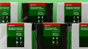
The packaging combines all the elements into a clear system with a clear hierarchy, which makes it easier to perceive. The graphics are balanced and emphasize the information, directing the buyer's gaze from top to bottom, where the illustrations are connected with the text. Thanks to the use of space, the packaging will become a bright accent on the shelf.
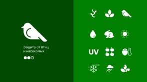
Icons help the consumer quickly navigate and instantly perceive information, allowing them to then delve into the details of the text next to them.

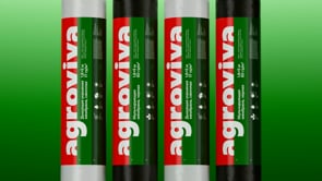

We use the logo on POS materials to attract attention with bright colors and a clean design. A large logo and corporate colors are well perceived even when inverted and are immediately associated with agricultural themes.

The identity system developed for the packaging is also perfectly adaptable to digital media. The photo style harmoniously complements the layouts and easily fits into the grids, creating a modern visual language of agriculture.


As a pleasant bonus, bright merch was developed as part of the project, which is not afraid to get dirty in the garden, since all the colors are natural.