Archetypes in Design
For the first time the archetypes classification was announced by psychiatrist Carl Gustav Jung. They described behavioral specifics of different types of people.
Subsequently, his works were rethought and adapted for a wide audience, including business. Now there are 12 basic brand archetypes that are actively used in marketing and advertising. Imagine, if your brand is a person.
LINII team, represented by art director Yulia Plotnik and designer Alexandra Yanchukova, consulted by strategy director Polina Vasilyeva, conducted a design study and classified each of the 12 brand archetypes into 4 categories: typography, graphics, photo style, palette.
Altruist of Parent driven by empathy, generosity and a desire to help others. For his it is far better to take care of others than of yourself. Sometimes he does not take into account someone's real needs and bases only on their opinion.
The typography of this archetype is soft, enveloping, but not playful. Neat collected grotesques with small serifs without excessive sweeping with moderate or low contrast.
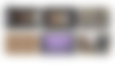
From a graphical point of view, the Caregiver has smooth, neat elements that create a sense of calmness and balance. The archetype is characterized by natural, natural, plant motifs. The worn effect may bring some coziness to his image.
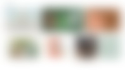
Typical for the photo style: mild lighting, naturalness, warm filters, textures contact that convey the softness.
The colors of the archetype are warm, calm pastel colors or non-contrasting black and white.

This archetype is convinced that any person has a value. He is not naïve and does not expect only goodness from life. Able to empathize and support. Wants to be accepted in society and communicate with others.
Regular Guy's typography can't contain any antiquas, hints of serifs, or any pretentiousness: rounded and clear fonts, monospace without any contrasts inside the letters, as well as slightly imperfect fonts.
The graphics of this archetype is also friendly: some geometric shapes or live lines — ovals, circles, triangles, most often vector shapes without shadows. All sorts of communication bubbles like messengers, symbols of association and units are frequently used.
For the photo style of the archetype, the involvement of the character in the campaign or in the familiar environment is important: naturalness, comfort, simple human pleasures.
Regular Guy's colors are: bright and clear colors, like children's crayons or paint cans. Here, natural colors rather earthy, are added. And here it refers us to nature and naturalness.

Savior of the world and fighter for justice. Resolutely achieves the goal, despite the obstacles, but deep down he is afraid to fail. The Hero is proud of self-discipline and does not always know how to stop.
The typography uses powerful and bold fonts. They immediately attract attention, can be with a dynamic incline.
Hero's graphics consists of bright and confident geometric shapes, dynamics and brutality.
The photo style is distinguished by portraits of people who refer to superheroes. People and architecture in the photo can be shot from the bottom up, which brings power, heroism and monumentality. Or just a large object in the center on a clean background.

Colors are bright and clean, black and white or military.

He has a special desire for happiness and needs care. Believes in the existence of an ideal society. Very trusting. In everything he tries to do the right thing and is afraid of being punished if he did something wrong.
The typography of Innocent is characterized by swollen plump lettering, naive fonts, suitable for children's cartoons.
The minimalistic and rounded graphics of the Innocent maintain a childish mood: pictures drawn as if by a child's hand applications with uneven shapes.
Photographs do not have to contain children, but should refer to a world without problems and worries. An idyllic life in the bosom of nature or a picture of ice cream is fine.
The palette is pure active colors, as well as pastels, which are more about innocence.

He is constantly searching for that will make his life better. Appreciates freedom and seeks new experiences. He learns and tries everything on his own. Often chaotically moves from one business or hobby to another. For the Explorer archetype, freedom of movement and new knowledge are above all. The road, travel, adventures are its eternal attributes.
The typography and design refer to travel, movement and diversity. For example, with the help of dynamic lines, waves, ethnic motifs, open compositions.
The Explorer's photo style is supported by the visualization of any kind of movement, exploration, travel: photos of familiar landscapes or exotic nature, roads or any type of transport, curious people, even space themes will do.
The palette of the archetype consists of the sea, earthy and grassy colors, also neutral black and white.

This archetype shocks people, causing a revolution, breaking the rules and getting rid of what doesn't work. He is attracted to actions that violate the norms of ethics and any decency. He does not care about himself and all around him.
Rebel typography breaks all the rules. These can be broken fonts, uneven letters, filled typography. Street graffiti fits in perfectly.
The graphics are characterized by intentional sloppiness, pixelated details, deliberately low-resolution pictures. It should read a challenge to the usual norms.
Photo style broadcast punk style: marginality, reckless behavior and ridicule of glamour.

The color palette is built on contrast: neon colors on a restrained black and white pattern, for example. Or is it a reference to street culture in sandy gray tones.

He always strives for aesthetics, intimacy and passion. Looks for admiration. Able not only to absorb, but also to share. Tries to strengthen the bond, afraid to be alone.
The typography is sophisticated and elegant. Often handwritten fonts and antīqua. All fashion magazines — Vogue, ELLE, Bazar — use high contrast letters, almost always serifs and other types of serifs and antīqua. Elongated fonts, emphatically beautiful and aesthetic, all sorts of strokes that convey pleasure and aesthetics — all this is the typography of the archetype.
Lover's graphics refer to hedonism, soft forms of the human body, alluring curves, beautiful 3D textures.
Photo style is also about sensual curves, iridescent silk fabrics, Bohemian baroque luxury and pleasure.
The palette consists of red and shades close to it, as well as beige, chocolate and gold.

The Creator is in search of his own personality, his own Self. The main difference from other archetypes is self-expression in creativity.
The Creator's typography can be anything, but the main thing is that it is original and has character: unusual font layouts, arced text, curly sets, text distortion.
Archetype graphics — collage illustrations, a combination of incongruous, brightness, fun, strokes, multi-colored dies, symbols, micro-illustrations.
The Creator's photo style is bright bizarre colors, unusual compositions, combinations, non-standard landscapes, elements of nature seen from an unusual angle. Collage, coloring in photography, extraordinary people.
The colors of the Creator can be any, but mostly bright.

The Ruler represents integrity and order. He forms his own state, that is, he builds his life.
The fonts of the Ruler are neutral, orderly, strict, as well as powerful, brutal. Classical antiqua convey well the adherence to traditions and the imperial style.
The graphics of the archetype go into premium and high cost. Simple geometry, references to the classics through engravings, art objects and a large amount of air in the layout.

The photo style of the Ruler maintains an luxury atmosphere: chic leather sofas, expensive architecture, majestic interiors, textures of stone, wood, and metal. If the photo shows people, then these are rather men over 40 in expensive suits, indicating their status.
The ruler's palette inspires calmness and reliability. Complex blue tones or other dark and deep shades of any color.

The Jester enjoys life and tends to see the funny in almost any situation in order to cope with difficulties. Pushes people to release illusions, depression and a limited view of possibilities.
Jester's typography is characterized by playfulness, pun and fun. This archetype is close to the Innocent, but here the fun is not naïve; sarcasm, parody, satire are used more.
The graphics involve images of the circus, tricks, hypnosis, reincarnations and transformations.
The Jester's photography style is replete with hypertrophied forms, strange perspectives, grotesque images, unusual angles, and distorted proportions.
In terms of colors, the Jester loves Christmas New Year shades, bright colors of confetti.

The Magician becomes a catalyst for intense and rapid change. Turns dreams into reality and believes that boundaries exist only in the head. Can explore patterns and make things work.
The Magician's typography is, firstly, floral motifs, sharp old-style serifs, referring to medieval books about magic. Secondly, these are super-futuristic fonts of an unusual shape with pixels, about robots, the future and about what for us is the magic of the 21st century.
Graphics is also divided into two types. The first is illustrations, such as woodcuts, Art Nouveau floral patterns with swirlsand illustrated. The second is the "luminous" technological type about new technologies and often with the use of gradients and pure manimalism. The Magician is very fond of textures through which one can peep through.
Mystery, secrecy, refraction are perfectly manifested in the photo style. Refraction through glass and water, twilight, moonlight — all this is inherent in the Magician archetype. If we are talking about manufacturability, then this is neon light a la steampunk.
Magician's colors are metallic, neon, dark backgrounds and gradients.

Uses the intellect to comprehend the world. Desires independence and truth. It has good intuition, calmness and equanimity. It has a shadow side, manifested in insensitivity and dogmatism.
The Sage's typography is dry and austere, with no decorations. They must clearly convey their idea so that nothing interferes with teaching people.
The sage is very fond of rulers, graphs, diagrams — everything that is associated with scientific calculations, with a scientific approach. The Sage's graphics are also minimalistic. Unlike the Magician, he is not about modern technologies, but about the accuracy of the calculation, which creates a detailed evidence-based picture: icons, drawings, structure and infographics.

The photo style of the Sage is distinguished by a white or calm background so that nothing distracts from the subject: the focus is on the subject, nothing interferes, as in a laboratory. Photo images are enlarged as if under a magnifying glass, you can look at and study.

Sage colors are monochrome, dark deep, bright black and white or digital modern.
