Изменение визуального облика известной марки одежды
Today BAON is a brand of both male and female clothing in the middle price segment with a 30-year history. Brand models are presented in branded retail and partner stores, in a mobile application, on the BAON website and all major marketplaces.

The need to meet the needs and values of the audience, remain relevant, transform and maintain high quality, manufacturability and a wide range - these are the theses that formed the basis of the rebranding.
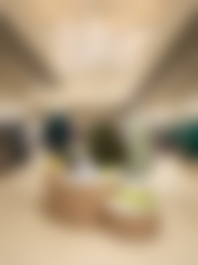
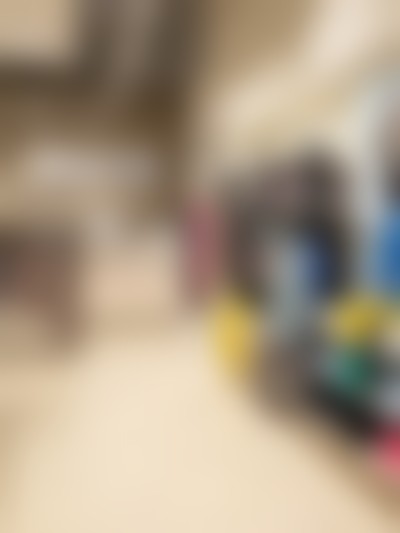
Together with LINII, the retailer carried out a large-scale work to refine the positioning, change the visual appearance and form the main vector for further development: a vivid emotional story with a philosophy of "easy elegance". In June, the transition to a new brand attribute began, and in July the first retail stores open in the new concept. A site modification project has also been launched.
The target audience of the brand are energetic and caring residents of megacities who like the rhythm of a big city with its benefits and advantages. Such a lifestyle is often accompanied by stress, so it is important to plunge into a comfort zone: a state where you accept yourself for who you are. BAON clothing does not interfere with and does not require to match it, but on the contrary, it allows you to feel comfortable and confident at the same time. It gives peace and comfort, but at the same time creates an exquisite image, regardless of the circumstances.
The new identity is based on typography, color palette and photo style. The font logo is built on conciseness, naturalness and beauty. It was developed from scratch specifically for BAON. The result was a recognizable and reflecting the character of the brand sign. In addition, logos for style and assortment directions, tags and labels were developed.
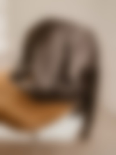
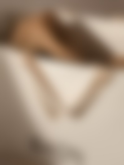
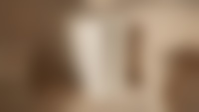
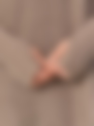
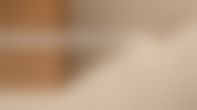
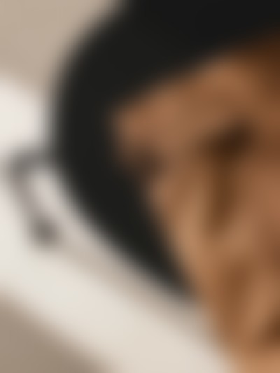
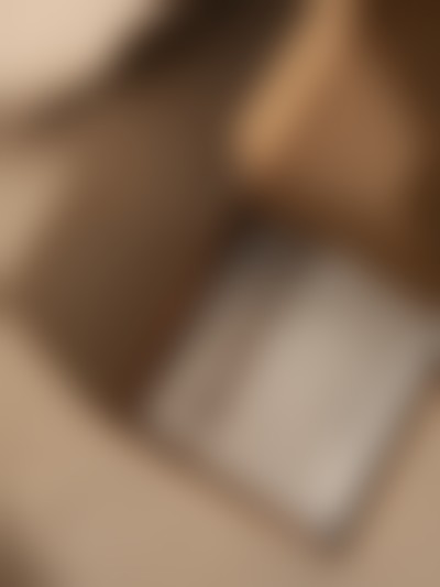
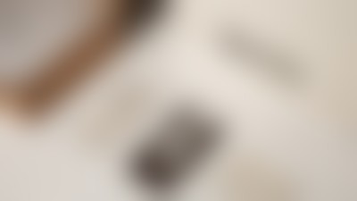
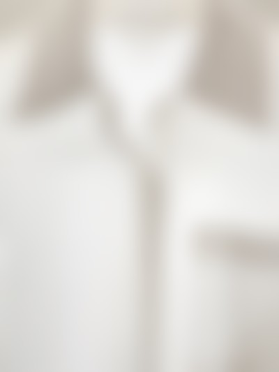
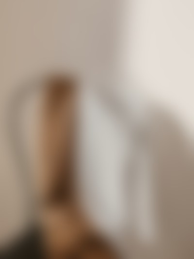
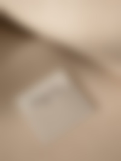
Photo style plays a decisive role, as it conveys the idea and mood of the positioning as much as possible. The images are warm, neutral and minimalist. All attention should be focused on the model: preferably if she looks at ease and does not look at the camera. The background can be defocused. Both static and dynamic frames are acceptable. Compositions with an emphasis on the product deserve special mention: this technique conveys the feeling that the thing is about to be removed and carelessly laid down.
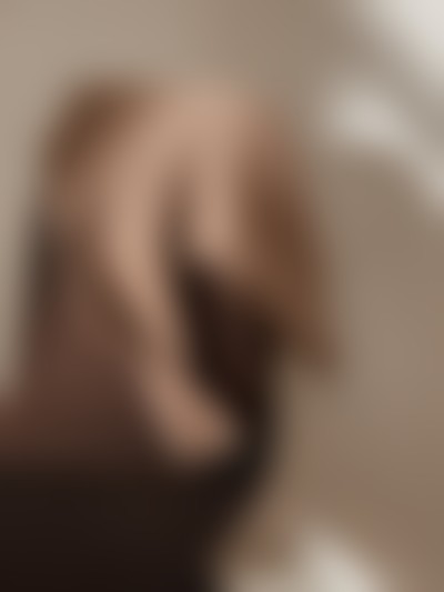
The palette consists of rich and complex shades: milky, pearl, warm gray, brown and black. There are also additional accent colors for special lines and communication design for sales and promotions.
7-е место в топ-10 российских fashion-брендов по продажам на «Яндекс Маркете» в сегменте масс-маркета.
Информация по итогам 2024 года. Источник: PROfashion.ru

По результатам внутреннего опроса покупателей, управляющим партнёром BAON, Анной Сироткиной отмечается положительная реакция покупателей и рост конверсии в ритейле. Оценка магазинов после реконструкции в той же локации проводится по показателю LFL. В среднем даёт около 20%, но в части магазинов достигает 40%.
Источник: интервью с Анной Сироткиной.
374-е место в номинации компаний среднего размера в «Рейтинге работодателей России» портала hh.ru
Итоги мая 2024 года. Источник: PROfashion.ru