
Moscow International Higher Business School (MIRBIS) is Russia’s first private business school, founded in 1988 under an intergovernmental agreement between the USSR and Italy. The school offers three main programs: MBA, Executive MBA, and DBA. The programs are designed for executives interested in personal growth, career development, or scaling their businesses.
Over 35 years, the school has built strong expertise and earned the trust of the professional community, but by the time it approached LINII, it was perceived as “just another business school”, had a fragmented brand identity, and lacked sufficient brand recognition.
Business school set an ambitious goal: to become a modern and recognizable brand that speaks the language of today’s entrepreneurs and managers and is firmly associated with solutions for real-world business. They chose LINII team as their partner to achieve these goals.
The new logo consists of two parts: a dynamic and progressive symbol, reminiscent of the letter “M,” in which the graphic emerges from a beam of light, and the company name rendered in the brand’s signature typeface. The vector, flowing from left to right, reflects forward momentum — both within the learning process and in the student’s career path.

From the client brief, it became clear that the school’s main strengths were its practical focus, the faculty’s deep expertise, and the high career effectiveness of its programs. MIRBIS is a school that helps solve real business challenges — not theoretically, but here and now. This is how the idea that formed the basis of the updated brand identity was born: MIRBIS creates a space for the exchange of experience and knowledge.
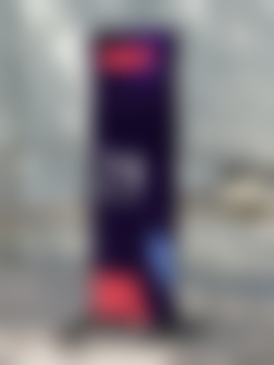
The primary color of the updated palette is purple, which sets a modern, confident tone. The secondary palette allows for easy variation in emotional tone — from calm academicism to vivid expressiveness. Color coding was also proposed for each academic program, simplifying the creation of communications.

To build the visual system, the LINII team proposed a clear, well-defined grid — not as a constraint, but as a tool. It became the foundation for a flexible graphic logic, allowing for the creation of numerous graphic variations and layouts while maintaining the brand’s integrity and recognizability across all media.
The typography is modern and energetic. It sets the rhythm of communications and creates the impression of a young, vibrant brand open to dialogue.
The brand graphics echo the geometric shapes in the logo: the shapes form paths, define space, and indicate a direction of development.


MIRBIS photographic style is based on the principles of natural light and candid scenes. There is no staging in the shots: the subjects do not look at the camera but act in real-life situations. The brand’s graphic elements are seamlessly integrated into the composition, creating a sense of dynamism and forward momentum.
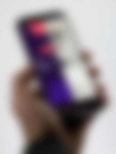


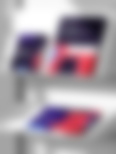
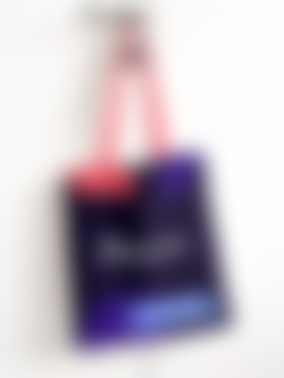
LINII designers developed a set of media that demonstrates the flexibility and scalability of the brand identity: from print materials and wayfinding elements to digital interfaces and merchandise.


MIRBIS brand identity turned out to be flexible and modern. At the project’s conclusion, the client’s team received a detailed style guide that defines the system’s logic and allows the brand to scale without compromising quality.